I currently read a lot of decorating blogs and it always fascinates me how people's styles evolve. For me, when we were first married and moved into this house my design style was {brace yourself please}
The "Whatever Was Already Done and/or
Free and Given to Me and/or On Sale" Style
I didn't really care what the house looked like. I was in college then working and traveling for business a lot. Pretty much always gone. Plus I was lazy. I absolutely hated painting, etc. And I was too cheap. I would rather use a cardboard box to store something than a decorative basket.
But thru the process of completely remodeling virtually every aspect of our home, and redecorating all the rooms, I have really been developing my design style. I'm not sure at this time what I would call it but it encompasses contemporary and casual styles with a lot of earth tones. Most of the rooms in our home are either brown, green or blue. All colors you find in nature. I find this very relaxing and peaceful.
I've also realized that other design choices play a huge roll in how cluttered our home looks and feels. It may not even matter if you've gotten rid of all the paper clutter and extra dishes and clothes. Maybe your walls, floors or furniture themselves are causing your space to feel overwhelming and cluttered. Bear with me as I show you a couple examples.
Study the following photos of bedrooms and think about which ones feels the most inviting and relaxing to you.
Did you prefer the vibrant patterned wallpaper, the slightly subdued patterned wallpaper or the plain painted walls? I definitely prefer the painted walls. I feel like I could actually sleep in that space.
Now, let's look at bookshelves:
This first option - Open, Floor-to-Ceiling Bookshelves. This just makes me cringe, honestly. If this were in my office/workspace, there is no way I could accomplish much. My mind is simply overwhelmed by all the books. I know some people may love this look, but I just couldn't have it.
This option is better. Even though these are open, floor-to-ceiling shelves as well, the molding and chunkiness of the shelf dividers makes it feel less cluttered. And the owner has done a good job of "styling" the shelves so they are jammed full.
This would be more my speed. I like having the doors on the bottom half of the built in shelves and the decorative chunkier moldings also make it seem less cluttered. I could live with this (but I'd add books, pics, etc.)
Now let's look at a couple other pics for fun. Perhaps you don't have patterned wallpaper or floor to ceiling cluttered bookshelves, but maybe you're dealing with something like this hideous sofa (be sure to check out the source on this photo - it's an ugly sofa contest...LOL!!):
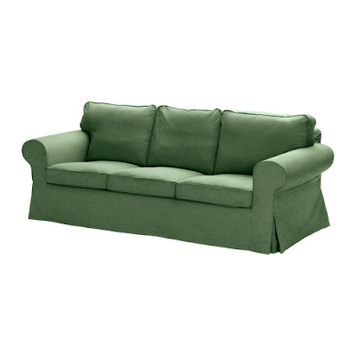
Perhaps your living room would be more welcoming with a solid colored sofa like this Svanby Green Ektorp from IKEA.
Or maybe you could just get a plain beige or gray sofa then bring color into your space with decorative, patterned pillows that could easily be swapped out as your tastes change. (Trust me...I have a plaid couch that I now hate.)
Don't get me wrong. I'm not "afraid" of pattern I just know that too much of it can be a turn off. I'm all about pattern in small doses like these fabulous pillows on a neutral sofa:
Or this bold chair in an otherwise serene and calming bedroom:
I also love the mixture of the patterned rug, colorful abstract artwork and printed arm chairs in this living room. There's a lot going on but it does not overwhelm your eye as you glance at the space.
So I challenge you to once again walk through your home and look at each of your rooms with a discerning eye. Are there any big elements like patterned wallpaper, carpet or large pieces of furniture that just fluster you? Can any of them be changed out, painted, slipcovered, etc. to make the space feel more serene?


No comments:
Post a Comment